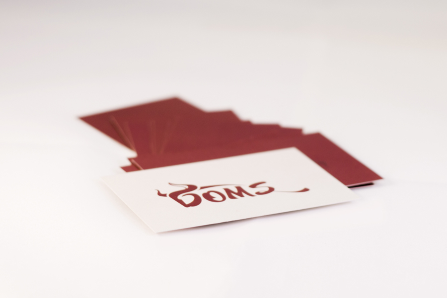
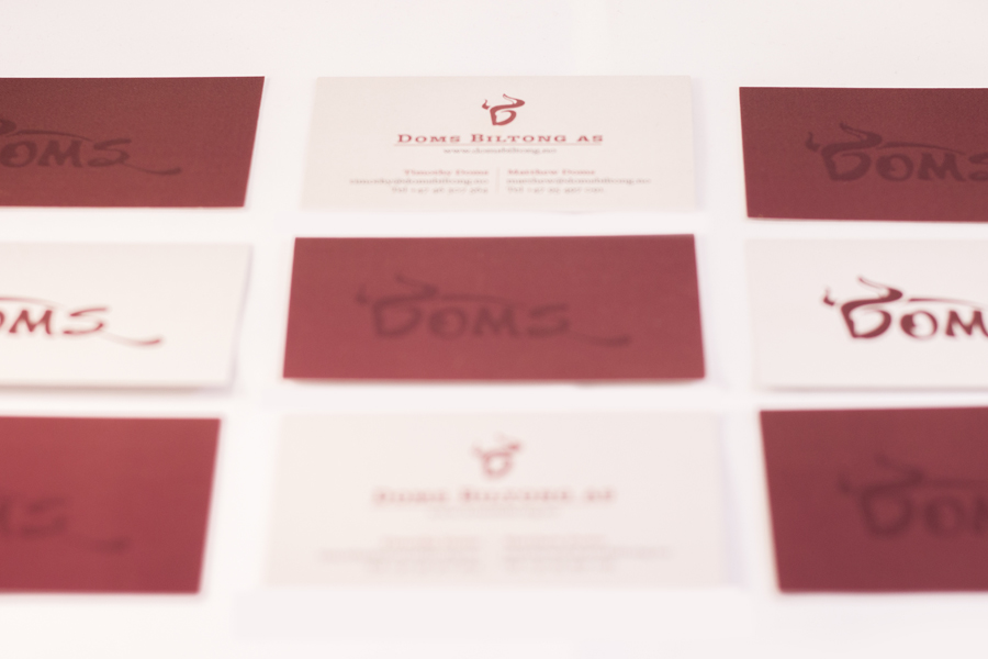
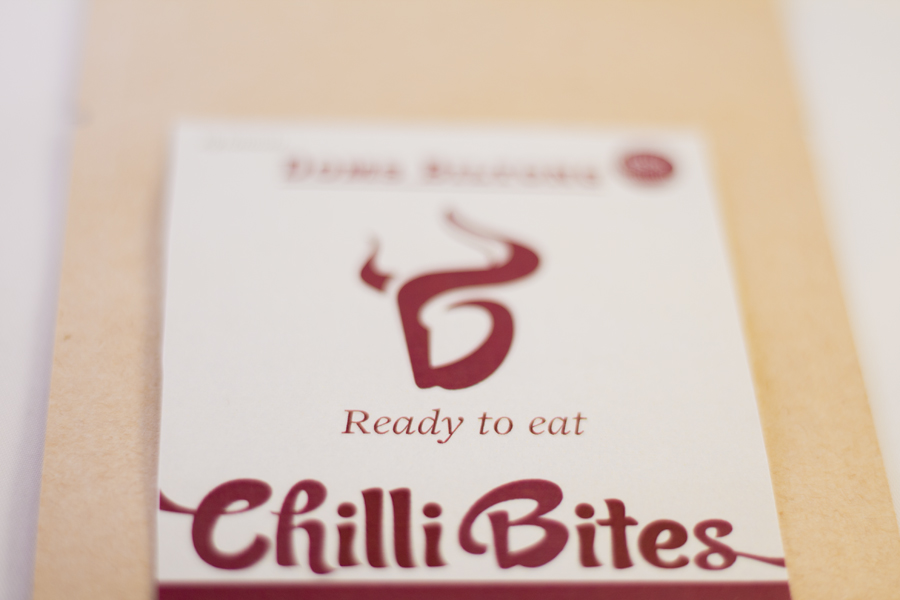
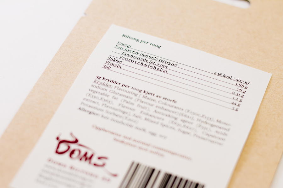
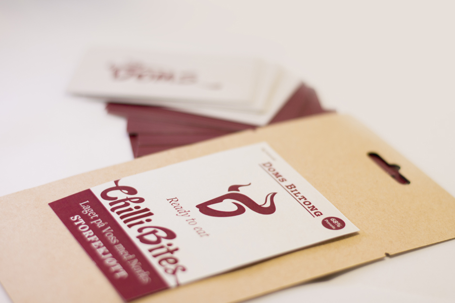
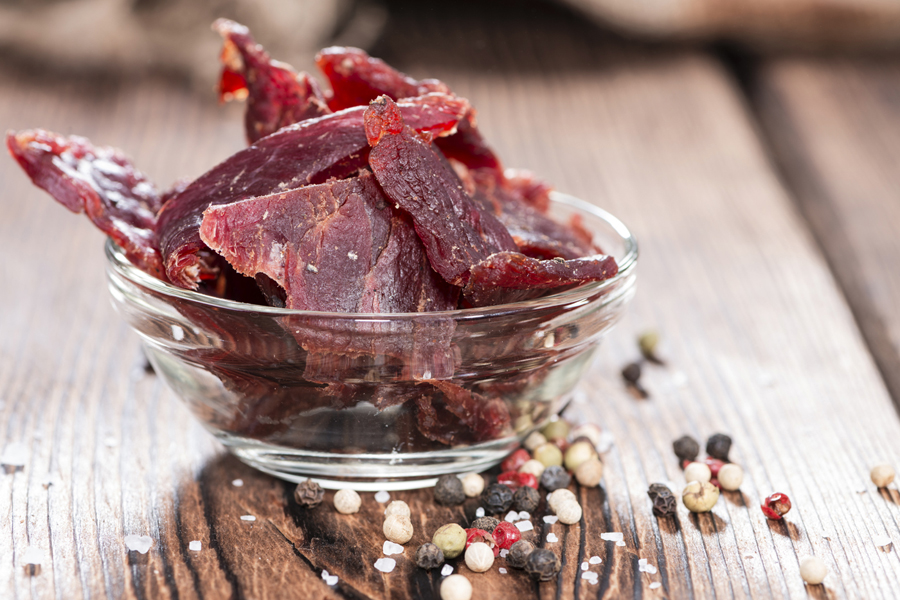
Doms Biltong was founded 2015 by the Brothers Matthew and Timothy Doms who introduced traditional South African Biltong to Norway. They hired me to create a visual identity for their brand. We are still developing the final product, but the logo, business card and the first prototype for the kick-off packaging label (Chilli Bites) is finished so far and I would love to share it with you.
Symbolism
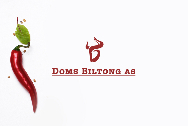
The logo symbol reflects the bulls head and the logo initials D and B (Doms Biltong), which one is being seen first is individual. There is a symbolical link to the origin of the product (the beef) and the company itself. The logo version where the symbol and the Doms font merge in a playful way, reflects the bulls body in a dynamic movement.
The following video gives you insights into the logo creating process. You will see my sketchbook, each page will be fast forwarded. I hope you’ll find it interesting.
A look into my logo sketchbook for Doms Biltong from seabee on Vimeo.
I have been experimenting a lot in order to find the right colors. In the video you will be shown different color schemes I invented and explored, maybe you will guess what lead me to the final color choice. The final color combination is not only meaty but also clean and reflects the product and quality.